CSS Environment variables; how to deal with the software bezel of iPhone X
Like many a web developer, I’ve found myself tweaking things of late for the iPhone X.
Personally, I don’t see the attraction with rounded screen corners. However, popular handsets like the Samsung S8, Google Pixel 2XL and LG G6 have them and now, the iPhone X too. So, tough luck web-developers, here’s a new constraint we need to consider.
There are posts out there already about this. Here’s one I read that set me on the right path: http://stephenradford.me/removing-the-white-bars-in-safari-on-iphone-x/. I’m going to go over some of the same content from Stephen’s post, purely for completeness but you should certainly credit him with any findings common in both posts.
So, let me define the problem. Suppose we have a floating action button fixed at the bottom of our page. By default, once we scroll a little on an iPhone X it looks like this:
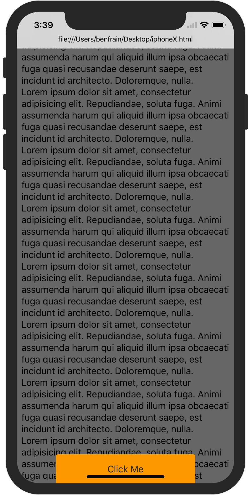
See the home indicator bar going right through the orange button? Due to the iPhone X’s home indicator, that’s no longer ideal as a hit area so we want to create some extra space so our button is still ‘hittable’.
At this point I’d forgive you for thinking that the iPhone X has merely removed the hardware bezel and forced us to adopt a software bezel!
Regardless, in the case of the iPhone X there is a home indicator bar to accommodate. Future phones – who knows! Point is, we don’t want to design in extra space around that button all the time, only when the device requires it for some omniscient software UI that sits above the browser level.
Initially, I believed that I would be forced into some awful combination of screen measurements and UA sniffing in JavaScript to create a forking point for the iPhone X. However, it turns out that there is, for the most part, a more elegant solution. Let’s take a look.
First of all, it is worth being clear that if you do nothing for the iPhone X, things will still function. There will be the usual dance with the Safari menu bar chrome (in portrait mode) but users can still get by. So, you don’t NEED to do anything. Any existing site will be perfectly functional. But you can do something should you choose to.
To accommodate tweaking, Apple has introduced viewport-fit=cover (from the CSS round display specification) and a few other goodies. However, unlike the afore-linked specification, you can’t use this setting with the @viewport at-rule like this:
@viewport { viewport-fit: cover;}That does naff-all. In Safari at least. I wonder what that does on a Samsung S8; anyone?
Instead you need to add this new setting as an addition to the viewport meta tag so you should have something like this as your viewport meta tag:
<meta name="viewport" content="width=device-width, initial-scale=1.0, maximum-scale=1.0, user-scalable=no, viewport-fit=cover">With that in place, Safari on iPhone X can extend, the content of a page into the sides where the ‘Batman Cowl’ sits when viewing your page in landscape. I’ve switched to landscape here as it is a better demonstration of the capabilities: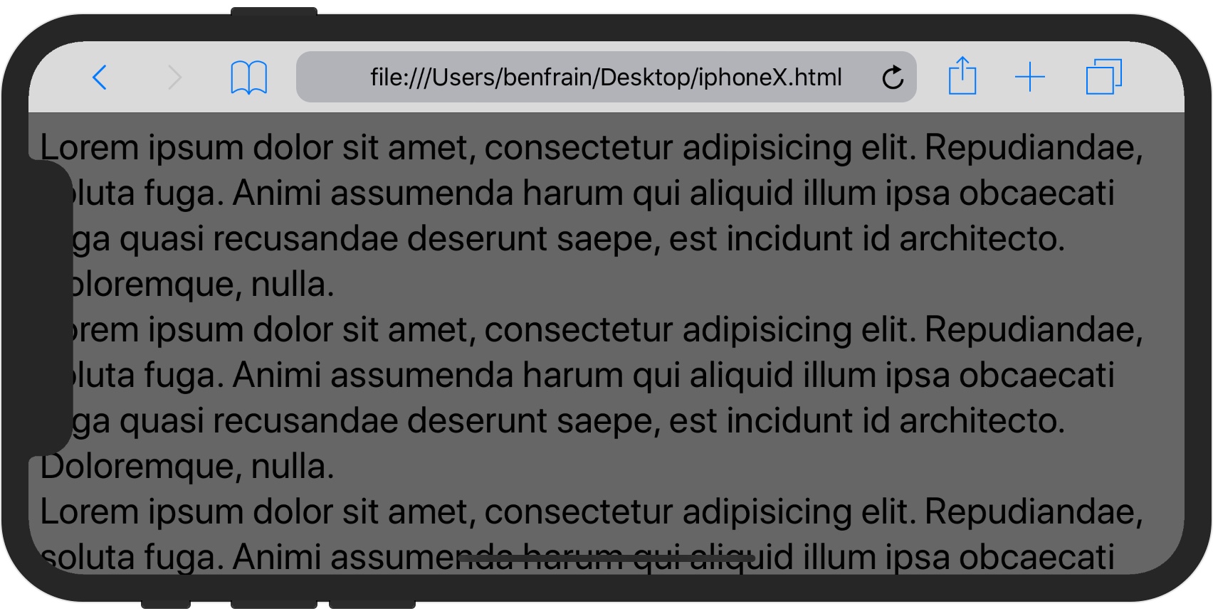
Which means that you could now have your standard website background edge to edge. By default, you would only get the background-color of the body tag extending into the side areas but with viewport-fit=cover you can have background images/patterns too. However, this creates another problem. How do we stop the main content entering the weird Batman Cowl areas on a iPhone X? Thank goodness, Apple have considered this.
Apple have borrowed an idea from broadcast TV. In TV land there has long been the notion of a ‘Title Safe’ area. This is an area inset within the main part of the screen inside which titles are set. Keeping them in this area means that titles wouldn’t be clipped when TV/Film had the aspect ratio changed or broadcasters for whatever reason needed to change the dimensions of the origin source. Apple has taken this basic principle and renamed it ‘Safe Area’ for their purposes.
How to apply the browsers ‘Safe Area’ as a value
Safari has exposed env as a environment specific variable in CSS, env being short for ‘Environment variable’. You can find more about its origin in this discussion on the W3C GitHub issues: https://github.com/w3c/csswg-drafts/issues/1693. Environment variables could be used for many things but the values we will look at next are the first to be usable thanks to Apple needing a solution to the iPhone X display.
Initially, Environment variables have been created that means any user agent can have their own value for safe-area-inset-top, safe-area-inset-right, safe-area-inset-bottom and safe-area-inset-left and so by using these keywords in our CSS, the distances should always be correct for the device/browser using them.
To exemplify, suppose the iPhone XI (because Apple’s numbering system makes little sense I’m extending the Roman numerals nonsense) comes along and has a safe area of 60px at the main axis start, 40px cross axis start and end 100px at the main axis end. If you wrote:
body { padding: env(safe-area-inset-top) env(safe-area-inset-right) env(safe-area-inset-bottom) env(safe-area-inset-left);}That would evaluate on the fictional iPhone XI handset to padding: 60px 40px 100px whilst it would probably evaluate to something different on a different phone with its own or no environment variable mappings.
Because CSS is so forgiving, browsers that don’t support env would simply skip the declaration containing it and move to the next.
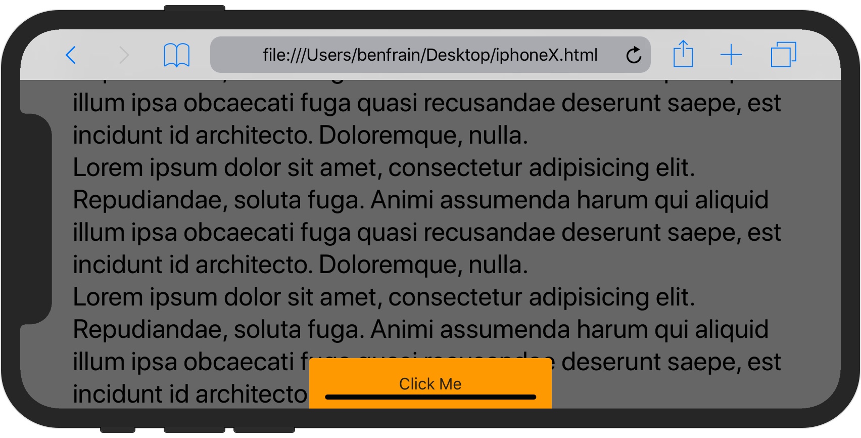
So, to fix our prior landscape example for iPhone 11.2 onwards, we could set padding on the body like the prior example and we would see this:
Fine, although my original problem was to do with fixing my floating action button. Let’s do that now.
The problem at hand
I can use that same environment variable to add padding/margin to the bottom of my floating action button.
To actually set these values in live code you need to know that there was a change of name for env that occurred before iOS 11.2. It used to be known as constant so if I want to ensure iOS 11.X prior to 11.2 is also covered, an extra line of code is necessary:
/*Default padding*/
padding-bottom: 0;
/*iOS < 11.2*/
padding-bottom: constant(safe-area-inset-bottom);
/*iOS 11.2 >*/
padding-bottom: env(safe-area-inset-bottom);
With that in place, I get this when I scroll down the page a little: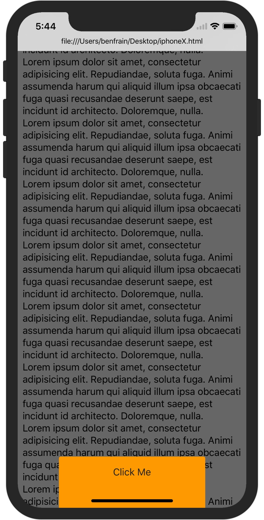
Great, right? Hmmmm.
env() just like you would any var() so you can also wrap it in calc and the like should you need e.g. transform: translate3d(0, calc(50px + env(safe-area-inset-bottom)), 0).A problem remains with iOS 11 and fixed position elements in landscape
We still have an issue. Switching to landscape, and scrolling up the page on iOS11, the Safari menu bar shifts away and we are left with this:

At first I had assumed this was something to do with the env(safe-area-*) stuff but alas it seems there is actually a bug in Safari on iOS11 relating to fixed position elements in landscape orientation.
I’ve opened a bug for this on the Apple bug tracker https://bugreport.apple.com/web/?problemID=35533943 as I’m fairly confident this can’t be the intended behaviour. The problem wasn’t there in iOS 10 or iOS 9.2.1.
Conclusion
Some manner for UAs to communicate device specific things to the browser is a good thing. The fact that Environment variables are now a standard, albeit a very sparsely implemented one, is a good thing too (they should be in Level 2 of CSS Custom Properties).
The ‘merits’ of the iPhone X’s idiosyncrasies are up for debate. Regardless, the task of dealing with unusual screen shapes is upon us.
Safari still doesn’t communicate anything, JavaScript wise, when their browser chrome pops in and out. This is a major pain point for web developers. Such a provision would at least allow developers to re-organise visuals in a non-hacky manner when Safari constantly ‘moves the cheese’ of the viewport chrome as a user switches orientation and/or scrolls up and down the page. I still despise the way Safari does this! It hard not to conclude that Apple expects users to use Safari for web pages only (not apps) and that it believes app-like functionality should remain the domain of Applications in the App Store.
However, I don’t see the rest of the world (especially outside of US/UK) following that pattern. More and more affordable handsets are loaded with Android, and the user base is growing steadily compared to iOS.
And Android embraces the web as an emerging application platform.
I can’t see the Apple bug and it says “This bug does not exist or you do not have access.”. I ran into the same bug. Is there any way for me to track it? Thanks.