How to get equal size icons in the cmp completion menu of Neovim with Kitty terminal
I’ve written a about my favourite Terminal emulator, Kitty, before.
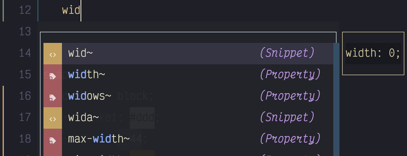
I am a big fan. However, there was one thing that was bugging me about it. When using Neovim, with the cmp auto-complete plugin, the little icons for the different kind of completions would show up in different sizes; even two versions of the same icon.

This is due to the varying glyph width of certain characters, what comes before/after them in terms of white space, and consequently how they should be rendered. Here are some good threads on this with the Kitty creator and others about why Kitty does what it does and why others are ‘wrong’.
While I agree with Kitty’s creator, Kovid, in principle, this still leaves me with a ugly looking completion menu in Kitty, that appears as expected, in other ‘wrong’ Terminals.
All is not lost. Kitty gives us the narrow_symbols config option that allows us to list a bunch of codepoints for each symbol we are interested in, and then a number for how many glyphs wide we want each symbol to render. This works by taking any taking any glyph that would ordinarily span 2 cells, and rendering it in the width of the given number, typically 1.
So, if you know what the codepoints are, of all the glyphs you want rendered as one cell in width, you can just set them in the Kitty config.
Even better news for you dear reader, if you use lspkind symbols in Neovim, because I went to the trouble (it’s fine, save the accolades, not all heroes wear capes etc) of getting all the code points for the icons used in lspkind, you can just copy and paste that info into your Kitty config:
narrow_symbols U+F027F,U+F01A7,U+F0295,U+F423,U+F0722,U+F002B,U+F0831,U+F0E8,U+F487,U+F0722,U+F046D,U+F03A0,U+F15D,U+F030B,U+F44F,U+F03D8,U+F0219,U+F0207,U+F024B,U+F15D,U+F03FF,U+F0645,U+F0E7,U+F0195,U+EA93,U+EA8C,U+EA8C,U+EA8C,U+EB5F,U+EA88,U+EB5B,U+EB61,U+EA8B,U+EB65,U+EA96,U+EA95,U+EB62,U+EB66,U+EB5C,U+EA7B,U+EA94,U+EA83,U+EA95,U+EB5D,U+EA91,U+EA86,U+EB64,U+EA92With that in place, you have uniform looking icons in your completion menu.

Also worth knowing that you can set that more than once so if there are other symbols you need that also need setting in that manner you can use that same config setting again and the extra codepoints will get added to the others.
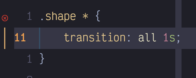
One final problem I encountered was that the diagnostic symbols I was using in the gutter didn’t go to two cells width with extra whitespace around them, so I was seeing this in the gutter.

Thankfully, it was just a case of using the Nerd Fonts cheatsheet to find some equivalent icons (warning, info, hint, error) that did span two cells with space next to them.

With that in place I finally had icon nirvana in Neovim and Kitty!
Hello, thanks for sharing info about Kitty. Currently I use Hyper and is anticipating switching to Kitty. I see you have a lot of styling and color scheme for Kitty. Would you mind sharing your configuration?