Attempting to fix responsive SVGs in desktop Safari (and some WebKit browsers)
Chrome and Firefox render inline SVGs in responsive designs fine. At the time of writing, Safari and some WebKit mobile browsers don’t. This post details the problem and the solution.
My esteemed colleague Matthew Mitchell (@_m_d_m) has been working on a personal project called Nice Letterform – http://nice-letterform.com.
As a typography aficionado he’s looking to emphasise key glyphs in typefaces. Go take a look in Chrome and you’ll see something like this:
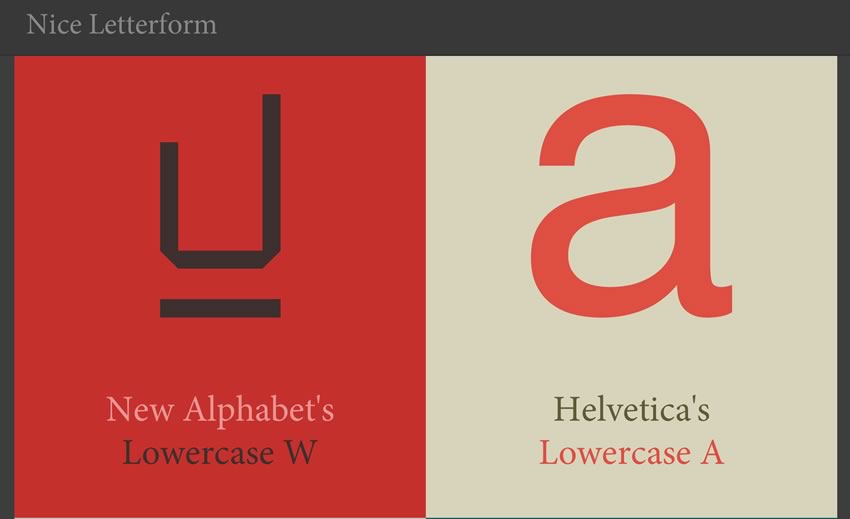
It’s a work in progress but what’s important at this point is noting the beautiful crispness of the glyph illustrations, the space around them and the title text below.
This is possible by using the SVGs inline within an object tag. For example:
<object><svg class="letterform" version="1.1" ... [truncated for brevity]
Besides being resolution independent, having the SVGs inline in this manner allows them to be manipulated with both CSS and JavaScript.
These SVGs are within fluid containers. Therefore, by setting the width and height of the SVG in CSS to 100% they should fill their container at different viewports:
svg {
    height: 100%;
    width: 100%;
}
Again, in Chrome, if you resize the browser window you’ll see expected behaviour (even with JavaScript disabled – more on the JS in a moment).
Now, without the forthcoming fix applied, if you looked at it in Safari (I’ve been looking at Version 6.0.5 (8536.30.1)) you would find it looked like this:
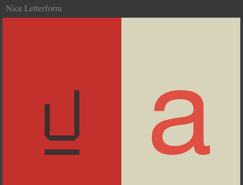
Safari is oddly computing the height of the SVG incorrectly. If you want to see the difference first hand, with everything else stripped away, here’s a Codepen example:
http://codepen.io/benfrain/full/fhyrD
It shows the Safari problem – the pink background should be barely visible and yet it fills the full page height in Safari.
I tried to get input on Stack Overflow to make sure I wasn’t doing anything obviously stupid (always a distinct possibility). Sadly no answers were forthcoming.
In time this problem will go away. It’s already been addressed in the WebKit nightlies (the bleeding edge versions that Safari is based upon). It’s therefore safe to accept it’s an edge case. However, in some circumstances, such as http://nice-letterform.com, it’s a bit of a show stopper on the affected browsers. Blinded by frustration, the only thing I could think of was to bring out the big hammer.
The only viable option seemed to be to dynamically set the width/height of the SVG in pixels as the page was resized (it’s only the height that Safari is computing incorrectly so we can use the width to figure the height). Having the height and width of the SVG set with pixels seemed to make Safari happy. Enter JavaScript (NOTE! Sergio has a much better solution in the comments so ensure you read on!).
As Matt’s site was so light-weight it felt wrong to attempt this with jQuery so vanilla JavaScript was the tool of choice. Now, I’m certainly a beginner level JavaScripter but as I’m reading Stoyan Stefanov’s incredible book Object-Orientated JavaScript I was feeling brave.
You can view the entire piece of JavaScript at this GitHub gist: https://gist.github.com/benfrain/5880387#file-jsfixforresponsivesvgsinsafari-js. The script also attempts to deal with SVGs used in <img> tags but that’s of less interest (the comments in the JS should explain what’s going on).
However, for anyone still reading this, here is the basic logic of the JS:
– Find all the SVGs on the page
– Make a loop for each
– Get the computed width for each SVG
– If there is no height or width defined on the SVG use the SVG viewbox width and height values to figure the proportional relationship between height and width and then from the computed width set the width and height attributed of the SVG accordingly
– If there is no viewbox or width and height, set both height and width attributes of the SVG to be the computed width
It seems to work well on page load, however, despite firing the function on page resize and the SVG width/height being correctly set in px, Safari only responds to the new size on a complete page reload. Sadly, I had to go nuclear and force a page reload after 50ms of a resize event firing.
The JS weighs in at only 2KB (1,936 bytes)/797 bytes gzipped so it’s certainly not heavy from a file size point of view. However, Sérgio Lopez has a far better solution.
A better solution from Sérgio
Thankfully, Sérgio Lopez has commented below and pointed out a far better solution. That’s to employ the intrinsic ratio’s for video solution described by Thierry Koblentz in A List Apart. If you’re wondering why that works, go give that great article a read. If you just want the cut and paste solution:
First, the object tag that wraps the SVG:
object {
	width: 100%;
	display: block;
	height: auto;
	position: relative;
	padding-top: 100%;
}
Now for the SVGs themselves:
svg {
	width: 100%;
	height: 100%;
	position: absolute;
	top: 0;
	left: 0;
}
That’s it – no JavaScript required!
Conclusion
While this issue is an edge case, thanks to Sérgio, if you run into this issue, here is a nice simple fix.
I had this problem too once and I think I solved it only with CSS using the intrinsic ratio technique people usually use for video/iframe (http://alistapart.com/article/creating-intrinsic-ratios-for-video)
Codepen: http://codepen.io/anon/full/rHIGD