CSS performance test: Flexbox v CSS Table – Fight!
Is the latest Flexbox implementation slower than CSS table layout? Yes, it is. But not enough to concern yourself about. If you need to use Flexbox, use it. For all but the most extreme situations, any speed difference against other layout methods is largely inconsequential.
display: table and display: table-cell in the first place, I wrote a post in July 2013 covering the benefits of using these properties for responsive web design: http://benfra.in/20m
Introduction
I’m a flex layout fan. I was writing primers on it back in April 2012, so don’t assume I’m some Flex layout hater.
However, I also try and be a pragmatic coder so I’m always keen to look at the best time and place to use the latest and most useful techniques.
Flexbox got some heat in the past for being slow. However, this was based on the old implementation of the specification. The HTML5Rocks site demonstrated that new Flexbox was not slow.
Since reading those articles a while back, I was always interested to know how the new Flexbox implementation compared (performance wise), given the same task, as a more established layout method such as display: table. It was time to put on the lab coat and safety goggles.
Methodology
To compare display: table to display: flex I wanted to compare two visually identical layouts. The same kind of treatment that can be solved with either layout method; a flexible row, with defined width sections and vertically centred text. It’s the kind of thing that display: table; has done well for years and Flex layout also excels at:
It’s been kept deliberately low on additional styling so the only differences are the layout method employed.
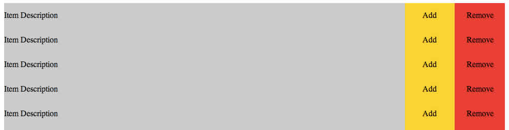
To create a significant challenge, a DOM was created containing 1000 of these blocks:
<div class="wrap">
    <div class="cell description">Item Description</div>
    <div class="cell add">Add</div>
    <div class="cell remove">Remove</div>
</div>
The table.html page had this style block:
.wrap {
    display: table;
    width: 100%;
    table-layout: fixed;
}
.cell {
    display: table-cell;
    height: 3rem;
    vertical-align: middle;
}
.description {
    background-color: #ccc;
    width: 80%;
}
.add {
    background-color: gold;
    width: 10%;
    text-align: center;
}
.remove {
    background-color: red;
    width: 10%;
    text-align: center;
}
The Flex.html page had this style block:
.wrap {
    display: flex;
    width: 100% ;
    justify-content: center;
}
.cell {
    display: flex;
    height: 3rem;
    align-items: center;
}
.description {
    background-color: #ccc;
    width: 80%;
}
.add {
    background-color: gold;
    width: 10%;
    justify-content: center;
}
.remove {
    background-color: red;
    width: 10%;
    justify-content: center;
}
As you can see, very similar amounts of CSS to achieve the same layout with each method.
Measuring performance
I used my new best friend, the Navigation Timing API to measure the layout speed of each display method. As with my previous CSS performance post, the same caveats apply. Specifically, at present, the tests can’t be run in Safari (Desktop or iOS) as it doesn’t support the Navigation Timing API.
Both pages ended with this piece of JavaScript:
<script type="text/javascript">
    ;(function TimeThisMother() {
        window.onload = function(){
            setTimeout(function(){
            var t = performance.timing;
                alert("Speed of selection is: " + (t.loadEventEnd - t.responseEnd) + " milliseconds");
            }, 0);
        };
    })();
</script>
Each page was loaded on a number of modern browsers to measure the page render time (in milliseconds). The results were recorded over 5 ‘runs’ and the results averaged.
Here are the results (each ‘run’ result is comma separated and the average of each group of 5 is displayed in square brackets). All time values are in milliseconds:
Chrome Version 33.0.1750.152 (Mac)
Flex:
47,47,48,43,44 [45.8]
Table:
42,44,46,44,47 [44.6]
Table layout is 2.6200873% faster
Firefox v28 (Mac)
Flex: 176,240,160,240,248 [212.8]
Table: 139,124,127,122,127 [127.8]
Table layout is 39.943609% faster
Opera 20 (Mac)
Flex: 48,50,49,50,50 [49.4]
Table: 50,46,46,45,50 [47.4]
Table layout is 4.048583% faster
Internet Explorer 11.01
Flex: 29,32,39,31,30 [32.2]
Table: 28,27,27,28,28 [27.6]
Table layout is 14.2857143% faster
Chrome Version 33.0.1750.152 (Android 4.3)
Flex: 457,394,385,484,357 [415.4]
Table: 345,378,354,367,368 [362.4]
Table layout is 12.758786712% faster
Firefox 26.0.1 (Android 4.3)
Flex: 2647,2610,2764,2529,2315 [2573]
Table: 2053,2032,1981,1944,2292 [2060.4]
Table layout is 19.9222697% faster
Comparison testing at WebPageTest
After the initial tests I reached out to Paul Irish (Chrome Developer Relations) to ask whether the results are inline with what he would expect. He recommended running the tests at WebPageTest:
@benfrain I would recommend doing like 10 runs on WebPageTest and checking the ms total for Layout: http://t.co/4p6rbut5w4
— Paul Irish (@paul_irish) March 26, 2014
I duly repeated the tests there and here are the results for each over 9 runs (the max possible at WebPageTest):
Chrome Flex 50,124,88,101,91,102,86,58,129 [92.111111111]
View the full results here: http://www.webpagetest.org/result/140326_8H_148R/
Chrome Table 87,89,66,76,83,78,45,39,33 [66.222222222]
View the full results here: http://www.webpagetest.org/result/140326_5Z_14DK/
Going on the WebPageTest results, Table layout is 28% faster.
Results summary
You can see that in this incredibly limited test layout, Flex layout is slower on every browser tested. Don’t read too much into this though. This test is a deliberate exaggeration and the chance that any significant speed difference will be apparent between these two layout methods is highly unlikely. Furthermore, Flex layout implementations are in their infancy; it’s doubtless that further speed optimisations will be made by browser vendors in the future. Still – that doesn’t mean I would always use Flex layout though.
Conclusion
If an identical visual can be achieved using the same quantity of markup, right now I’d choose display: table over display: flex. Not because it is any faster (although in this limited test scenario it universally is) but because it is more widely and robustly supported and implemented. If targeting anything but the very latest browsers, it will also require less CSS (quite a bit of ‘tweener’ syntax is needed to patch the older implementations of Flex layout in older browsers).
However, there are clearly plenty of things that can be done with Flexbox that just aren’t possible with other layout techniques – switching visual order being a prime example. Sadly, the properties I need most (like flex-wrap) are the most poorly supported. Until those properties are ubiquitous on mobile platforms I’ll probably stick with other techniques.
Your own mileage will hopefully vary depending on what you need to achieve.
Nice. Thanks for the update. 🙂
We’re looking at a delta of 26ms between the two approaches. That’s a lot if its happening during an animation, but counts for something like 1/3 of a script/stylesheet in the head on a cable modem.
So its not as bad as 1 render blocking network request, but it’s not completely trivial either. Nice writeup!