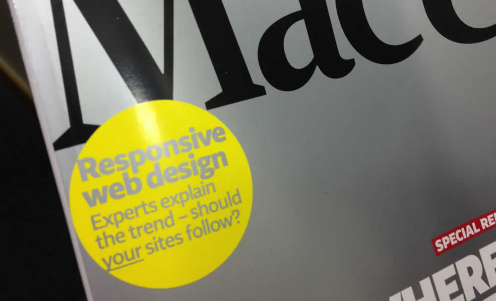
Responsive web design feature in MacUser magazine

A few months ago I wrote a feature for MacUser magazine in the UK on Responsive Web Design (issue: 25th May 2012 Vol 28 No 11). I didn’t want to do the usual ‘this is how to do responsive web design’ kind of thing, as that’s been done many times in many places. Instead, I set about speaking to the people I consider to be the smartest and most influential thinkers in this field and hit them with a bunch of questions.
How about his for an all-star cast of contributors:
- Ethan Marcotte/@beep (you know, that guy that ‘invented’ Responsive Web Design)
- Jeremy Keith/@adactio (all round web genius, author of HTML5 for Designers, speaker and technical director at Clearleft)
- Richard Rutter/@clagnut (author, speaker and founding partner of design consultancy Clearleft and web font service Fontdeck – also the first one to document use of img { max-width: 100%; } used in responsive images)
- Andy Clarke/@malarkey (author of ‘Hardboiled Web Design’, 320 and up framework, designer, speaker and writer)
- Leigh Howells/@leighs (UX Design Consultant at Headscape)
It’s like the Dirty Dozen but you know, 7 short…
As you might imagine, trying to boil down all the input and thoughts from these people without loosing anything was impossible (Jeremy Keith also provides a ‘DVD extras’ version of our exchange, providing his full responses – well worth a read) but regardless, I’m really pleased with the way it’s turned out. If you’re interested in what some of the smartest people in the web industry feel about Responsive Web Design, where it’s headed and best practice techniques when implementing it, I highly encourage you to seek it out. If you can’t get the print version, it’s available electronically on the iTunes store:
http://itunes.apple.com/gb/app/macuser/id468667540?mt=8
Alternatively, here’s a link to the magazine as a back issue: Responsive web design feature by Ben Frain for MacUser magazine.
Leave a Reply