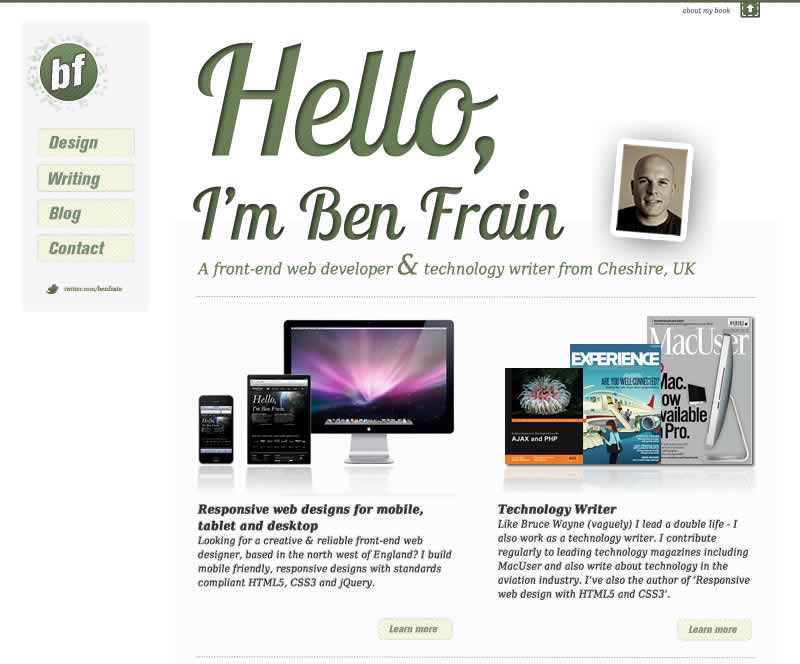
2012 redesign of benfrain.com
I try and redesign this site every year: it’s a chance to try out the latest and greatest techniques and implement what I consider to be ‘best practice’ ways of doing things. Sadly, like most web designer/developers, real life gets in the way. Working on client sites full-time means, our own sites are often overlooked. The last redesign I did was back in Feb/March 2010. Back then jQuery featured heavily, HTML5 was still an exception rather than the norm and the whole responsive web design thing hadn’t happened. Suffice it to say, I was the web equivalent of my Dad shufflin’ to LMFAO.
So, having set a week aside in late February, I set about a redesign. The 3 main aims I set were:
1. Speed
2. CSS instead of jQuery where possible
3. Responsive
I don’t know if every other designer features the same brain melt when they have to design their own site but I was paralysed with indecision. Couldn’t decide on colours, layout, fonts or anything in-between.
Here’s one of the original mock-ups in Fireworks:

I also tried alternate colour ways:

However, I gravitated back to a similar ‘nav top’ layout as previous years and went back to my good friend #ff9900:

It’s changed a little since going live, the temptation to tweak once it’s finally live is impossible to resist. Here’s some ‘behind the scenes’ highlights that only the geek’s reading this will be interested in:
Lazy loading of images when needed
As I was going for speed, primarily to aid those on cellular connections, on the main, web design and freelance writing pages, I’m using Modernizr to test for Media Query support over 550px. If it exists, the list of ‘who I’ve worked with’ is replaced with graphic images using an HTML ‘stub’.
Pure CSS3 Slideshow, if your browser supports it
Again, thanks to Modernizr, on the design page I’m using a pure CSS3 slideshow using CSS animations. It’s a technique I’ve covered in the book and I wanted to provide a ‘real-world’ example. If there’s no support for CSS animations, I’m using conditional loading to provide Flexslider (and an associated CSS file). That way, users only get the assets they need.
@font-face web Typography and icons
In previous years I’ve always employed Cufon when I’ve needed custom web typography. However, as @font-face is now a far better way to go I was able to use two or three fonts throughout the site. Better still, I’ve used a custom web font made up of icons to provide the icons throughout the site – again, whilst the font is anywhere from 24KB to 90KB (depending on the font your device loads), it’s only 1 HTTP request. In the words of Alan Partridge, “back of the net“!
CSS3 for everything
I’ve ditched images everywhere I can. All the box and text shadows and gradients are CSS3. Almost all the animation and transitions are CSS3. What does Internet Explorer see? Erm…I don’t care. The site is built using web standards and besides providing a polyfill for media queries in IE8 and below, the whole point was delivering something that is enhanced for smartphones and modern browsers (the present and the future) instead of OldIE (the dying past). I don’t imagine (fingers crossed) it’s dreadful but I’m not too fussed if it looks a bit ‘simple’ there.
A logo for high resolution ‘retina’ displays
Serving high resolution images isn’t always the best thing to do, but for browsers that support SVG, there’s an SVG version of the site logo. As it’s vector based it looks nice and crisp on high resolution displays. No SVG support? You get a PNG my tired old friend.
Tools
I sketched it by hand (with drawings that only I can comprehend), mocked it up in Fireworks, and coded it in Espresso/Coda (I’m still not fully converted to Espresso2. It does a lot of things I like but at present I find myself jumping across to Coda a lot – I know Coda2 will be great). I used Sass and Compass for all the styling and built the WordPress side of things on top of the rather excellent Roots Theme.
Would love any visitors to let me know what they think (yes, both of you)? Particularly Android devices and the like as sadly I couldn’t get my hands on anything other than an emulator to see how it looked.
Phew, that’s it. Hopefully it won’t take another two years before the next update. For now I’m pretty happy with the speed too, even Pingdom’s speed test told me I was a very good boy (I’m know it’s very un-British to be self congratulatory. To my fellow countrymen, I can only apologise)…

PS. Also added a custom 404 page…
Hi.Ben. came here from ur book…actually from ur book to the sample winner isn’t website, then to here.
U asked how it looks on android. I’m on one now. Site looks great…really see responsive web deaign in action. One thing I saw that wasnt very asthetically pleasing to me…every time I switch from landscape to portrait and vice versa, there’s a noticieable lag. And u can visiblly see text resizing and borders being extended to landscape size. I would expect it to be a lot smoother.
Is this a conscious design decision? A limitation of the browser (stock android browser), or the just the way css3 works? For my designs, I want it to be smooth. When I rotate the phone, i want the page to be instantly restyled with the user not seeing any of the transitions.
What are ur thoughts?
Joe
P.s.