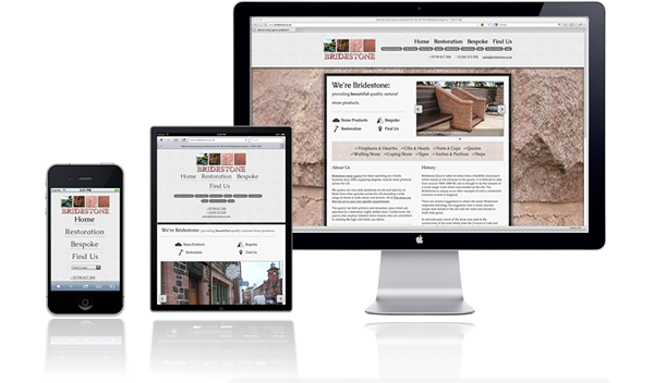
Another responsive design – Bridestone.co.uk now live

Another responsive website design I’ve designed and coded has just gone live. It’s built on top of Concrete5 CMS system and as it’s responsive it changes appearance depending upon the viewport size (same as screen size for most intents and purposes).
Despite using an HTML5 codebase, it employs a lot of CSS3 functionality. Alongside obvious necessities like media queries there are box shadows, gradients, text-shadows, @font-face and all sorts of goodness. I also used the lovely Flexslider for the home page carousel and amended the gallery on product pages so it also works responsively.
A final useful touch is that the product menu buttons switch to a drop-down select menu on mobile devices (anything with a viewport under 500px wide).
You can view the site now at http://www.bridestone.co.uk
Hi ben,
I am stll a baby in the woods with css etc and was interested in this a concrete 5 site based on susy?
I find that it doesn’t seem to behave on a tablet in landscape format and am tryinto gauge if this would be a likely stumbling block for me given that i have much less experience with coding a susy based site from scratch.