‘bb-grid’ – A simple, responsive, Sass based grid ‘thingy’ to lay out UI elements
Further to the post ‘Responsive Grid Frustrations – Susy, Zen and sub-pixel rounding’.
I decided to have a bash at making a simple solution to solve a very specific problem – how to lay elements out without suffering sub-pixel rounding issues and also having padding on just one side (so as to not have unwanted extra space on either side of a row of items).
I’ll make it very clear I’m standing on the shoulders of giants here; whilst this is no miracle of code, I should be clear that I’ve taken ideas from Susy, Zen grids and Salsa.
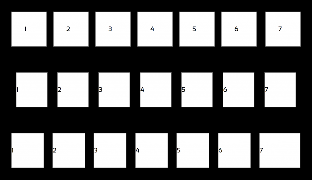
Here’s a grab from Safari (Safari is a chief offender of sub-pixel rendering woes) of three 7 column grids. The first is made with Susy, the second with Zen and the final one with bb-grid.

The short takeaway: Susy grids can suffer visual issues (gap too large in certain browsers), Zen adds padding on either side of a grid element (can be a problem if you are using a grid within an existing layout). bb-grid has the benefit of container-relative floats but only adds padding on one side (and not on alpha and omega elements).
Anyway, here is ‘bb-grids’ – it has very limited scope but hopefully someone else (other than me) will find this useful.
More info and download here:
Leave a Reply